Forget skeuomorphism, or even the newly coined neumorphism.
macOS Big Sur is flatter than ever.
In the last few weeks there have been a lot of suggestions that this is the start of a new “fun” era of visual design and that Apple is returning to skeuomorphism, or even a new thing called neumorphism. Neumorphism is a design trend that focuses on creating an impression of a realistic 3D environment using shadow and lighting effects.
The times may well be changing, but in my view we are not returning to an age of textured writing paper and stitched leather. This is why.
Icons, icons, icons
Since the unveiling of macOS Big Sur a lot has been made of its new iOS shaped icon set. Everyone seems to either love or hate the new icons.
Don’t be mislead by the icons - macOS icons have always been richer and more detailed than iOS icons. They have also used shadows and to create a sense of depth. In my view desktop interfaces are often more detailed as desktop users tend to use them for longer periods of undistracted time compared to mobile devices. Therefore adding more detail and richness is appropriate. In short, for as long as technology has allowed, macOS icons have been rich, detailed and realistic looking. Here are a selection of macOS Catalina’s icons to illustrate this:
The new icon set in Big Sur is simply a convergence of the existing highly detailed macOS icons with the consistent shape of iOS icons. During the WWDC 20 keynote, Alan Dye, Apples VP of Human Interface explained the rationale behind the new icons:
“We wanted consistency throughout the ecosystem so users can move fluidly between their Apple devices, but we also love that Mac icons have a deep history and a distinct look and feel. So we retained many of the highly crafted details and th playful elements that make Mac icons unique”
It’s also worth remembering that in many places the icons in macOS are simpler than before as Apple is porting its unified language of symbols from iOS. This means that in many places, existing detailed icons have become simple, monochrome 2D icons.
Big Sur is flatter than ever
This may surprise a few people, but if you look at the user interfaces in macOS Big Sur and compare it to the current release Catalina you won’t see richer shading and detailing. Also, while macOS Big Sur uses transparency, and shadows to create the impression of layers in the UI, this isn’t a new thing for macOS.
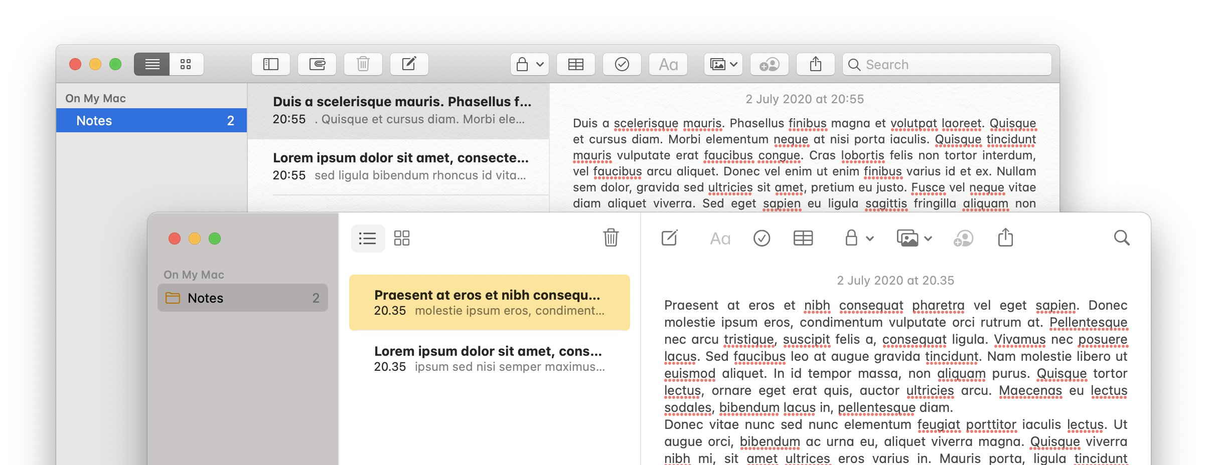
Actually, you’ll see a lot of the detail, texture and shadows have been removed. As a whole, macOS Big Sur’s interface is cleaner and more minimalist than ever. One of the aspects I’ve noticed most is there tends to be less contrast between UI elements. Apple has also completely dropped the aluminium inspired window chromes which can be traced back to Quicktime in the 1990s.
Take for example the notes app. The faux-paper texture has finally been completely removed. The toolbar buttons no longer have containers and there is no background separator between the toolbar and writing area.
If anything the design trend is convergence with iOS
This is not a new paradigm in visual design, but a shift towards unification between platforms. There is increasingly less separation between iOS and macOS. Both in hardware with Apple’s switch to an all ARM architecture and software where iPhones and iPads can now do many of the tasks once reserved for desktop computing.
In many ways the interface changes in macOS Big Sur reflect this transition. The iOS glyph icon set, the removal of distinct buttons and increasingly rounded corners. Apple has clearly been asking why interface elements on an iPad and a Mac should look different, and come to the conclusion there’s no longer a good reason for this.
On the topic of conversion, one interesting question will be how much further this transition goes. Can we expect to see touch enabled laptops? Dual booting iPads? iPhones with docking stations?
But what about fun design - isn’t that coming back?
As a designer I’ve often found the trend towards flat, minimalist design frustrating. I pretty much always have an urge to add little embellishments or extra layers to work. I then subsequently almost always end up removing them. Either due to what I’ve learned when testing the design with users, or just realising that these extra details often end up detracting from the bigger picture.
This doesn’t mean there’s no value in intricate detailing. If you are a designer and you can inject a fun details into your work in a way which delights and enriches your users lives then I implore you to do this. I just don’t think that macOS Big Sur is the signal we’ve all been waiting for to bring out those shadows, textures and bevels.


Leave a reply