Honeycomb Design System
2015 - 2018 • red-gate.com
Honeycomb is Redgate’s design system. The purpose of Honeycomb is to make it quicker and easier for designers and developers to create a coherent Redgate experience.

Overview
I lead the design and development of Redgate’s design system, Honeycomb. I work with a Web Developer and a Graphic Designer in order to design, document and share components.
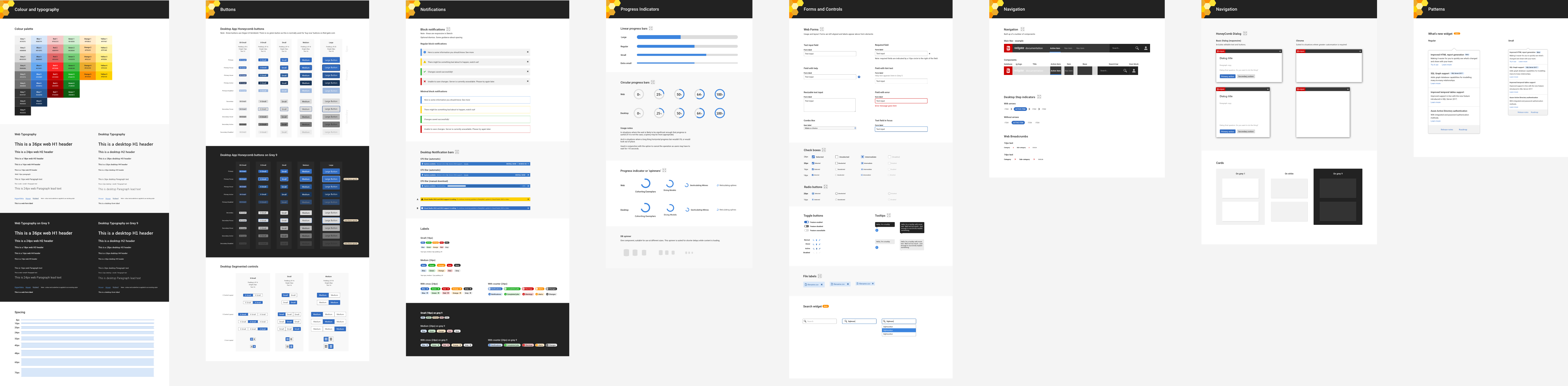
My main contributions have been to design and build a flexible library of components and patterns to provide Redgate's users with a coherent experience. This includes atomic elements including buttons, typography and colour through to complex interaction patterns such as in product notifications and update mechanisms.
Building the right components for our developers and users
Over the past year I've worked hard to design new components and incorporate existing Redgate UI elements into Honeycomb.
The goal was to create a comprehensive library of components which allows designers and developers to quickly and easily create mock-ups or prototypes, without having to spend time designing basic UI elements from scratch. To ensure I was designing the right components, I carried out audits and regularly met with designers and developers across the company.
Building a library of components for designers
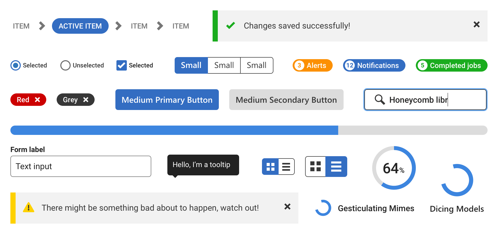
A particular focus has been on developing a library of easily sharable components for designers.
Although we made significant progress in developing a design system, designers were still finding it time consuming to create high fidelity mock-ups. There was no easy way to share components and specifications, or update designs after changes were made to Honeycomb.
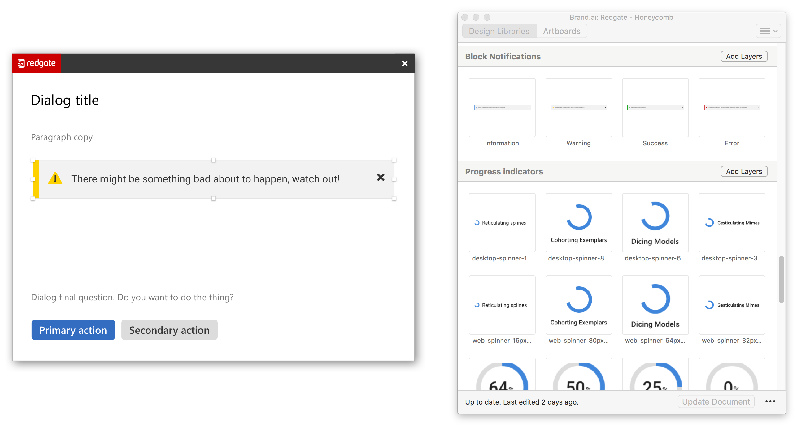
This also meant there was duplication of work, with designers individually mocking-up existing components, and subsequently inconsistencies arose. For example, when auditing how Honeycomb had been implemented in the wild, I discovered at least six different interpretations of a primary button.

A Sketch library for faster mock-ups
After evaluating numerous approaches, and gathering requirements from colleagues around Redgate I developed a shared library of components using Sketch and Brand AI. I created over a hundred reusable components and developed a process for contributing to and updating the component library.
Subsequently I have run training sessions and produced documentation to get other designers up to speed with the library and provide ongoing support. The Sketch library has now been widely adopted by Designers at Redgate, and consequently we are seeing a greater level of consistency in how Honeycomb is being implemented.
UX Cambridge session: the road to faster mock-ups
I recently gave a talk at UX Cambridge. The talk shared our experiences of building a design system at Redgate, and provided a practical guide to developing a componentised library using Sketch in order to speed up the creation of mock-ups.