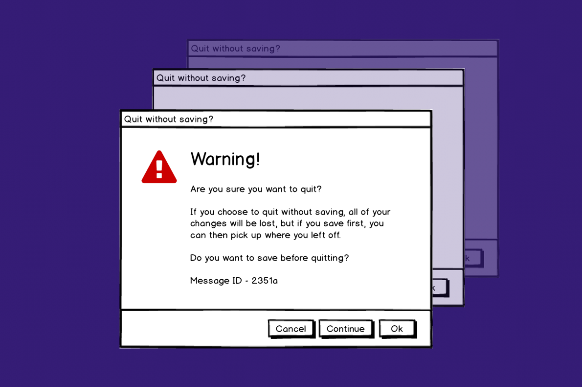
All too often the words used in software (and websites) suck.
In most cases, I assume development teams don’t intentionally set out to confuse users (unless you count the team responsible for selling insurance on the Ryanair website! ) However by asking the wrong question and pairing it with a seemingly random assortment of possible responses the dialog box becomes unfathomable.
I’m not claiming to be a gifted copywriter. Far from it, I can barely string a sentence together. But the point is, it’s really easy to get things wrong.
Luckily there are a number of rules you can follow in order to write passable (if not great) user interface copy.
Link - From Google Ventures: 5 rules for writing great interface copy