
I’ve recently been reading Steve Krug’s excellent book “don’t make me think” and it’s reminded me of something on the Microsoft website which has bugged me for years.
The Microsoft website is most likely one of the largest websites in the world. A good example of this is that it still contains full documentation for Windows 3.0 which was released in 1990!
The Microsoft website’s vast scale means that it’s crucial for it to be easily navigable. One of the most basic ways of achieving this is to reassure a user that it’s okay to explore, by having a consistent Site ID (basically the logo at the top left) on every page. This means that you can easily return to where you were previously if you click on something and it’s not what you wanted.
However, this is sadly not the case on the Microsoft website. Microsoft has chosen to expand some of it’s products such as Office out onto their own standalone websites with unique site IDs. This leads to a really jolting user experience.
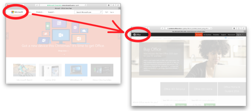
Imagine for instance you head over to Microsoft.com to look at Surface tablets, but you see an appealing ad for Office, so you click the link to check it out.
You’re then transported to the Office product homepage (probably without realising you’re visiting a different website). What you probably won’t notice at this point is that the site ID, and navigation menus all change, so it’s now more difficult and confusing to work out where you are in relation to where you started out!