This week my boss and I were debating whether we should add an option to an app we’re working on.
The app in question displays photos on a TV. Simple really, except photos are typically a different aspect ratio to TVs.
We had three basic choices:
- Fill the screen with the photo; meaning in some cases photos would be badly cropped, (kind of like those old holiday photos with an ex hastily cut out).
- Resize photos to fit the screen; meaning most photos would have black bars alongside them. This hardly creates an immersive experience.
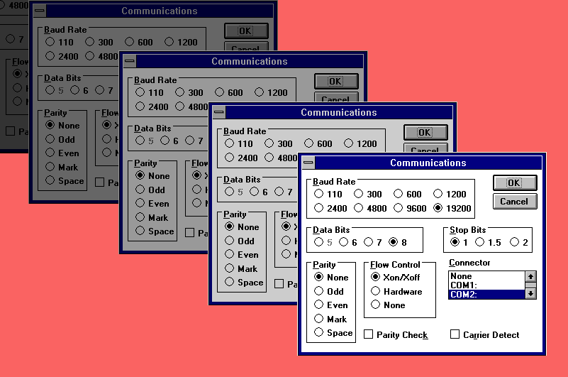
- Let users select from one of the above options. This would add additional complexity. It would also mean our users would have to seek out the setting, then pick the right option after noticing their photos were messed up. None of these approaches were great.
So what did we do? Ultimately we ended up designing an automatic mode, whereby we try to detect what kind of photo is being displayed, and try to do the best thing. For example, fill the screen with beautiful landscape photo, but fit in a portrait so that everyone can be seen.
We also decided to include the two options to either fill or fit the image. The advantage of this is that for most users, the app will just work, but for those users who do really care, they can control exactly how their photos are displayed.
So why am I sharing this story?
This led to a discussion about whether options are a good thing. After a lot of contemplation, I think we’ve reached a conclusion:
The golden rule on deciding whether to add an option is to understand whether the choice matters to your users. Or as Joel Spolsky neatly sums it up, “Only ask users to make choices for things they care about.”
I’d definitely recommend reading Joel’s article on choices. Even after 19 years, it’s still wholly relevant.
Leave a reply