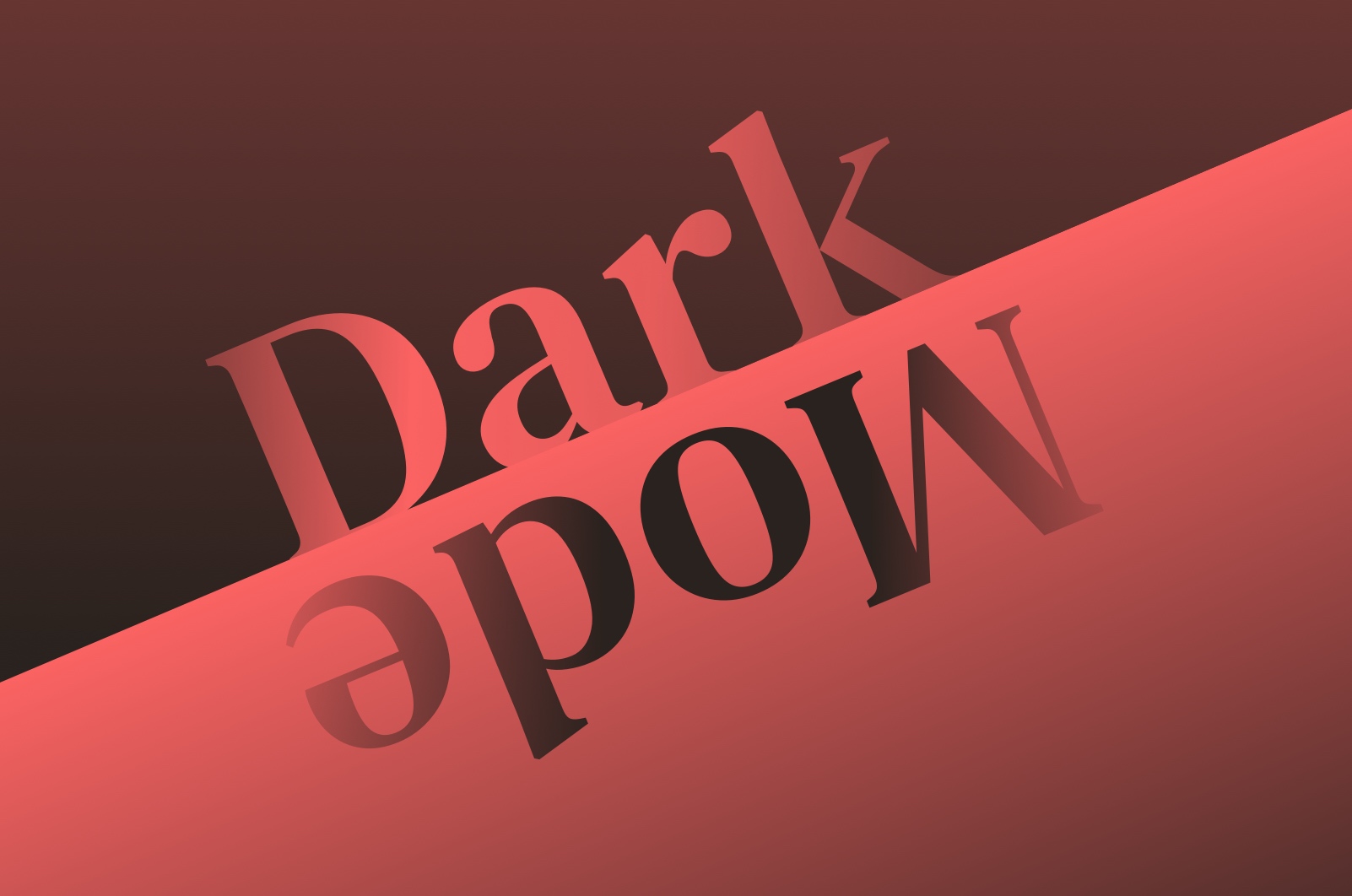
2019 is apparently the year of dark mode.
It’s reached Windows 10, Mac OS, Android, and has recently made its debut on iOS. Almost everyone seems to be switching to dark mode and extolling its benefits. These supposedly include: extended battery life, being easier on the eyes and aiding focus when working.
Apple even describes dark mode as “a dramatic new look that helps you focus on your work”.
While there’s no denying it looks beautiful in demos on product websites, I just can’t get used to it in practice. In fact, I tried dark mode for a few weeks, but for me it just doesn’t work at all. It comes down to one thing:
Reflections.
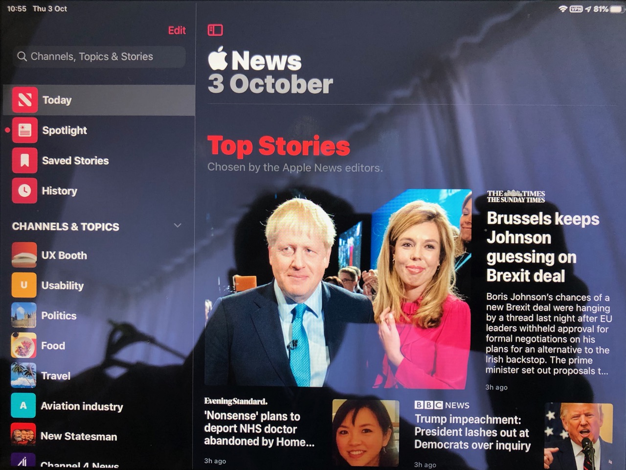
 Here’s what I’m talking about. (Apologies for taking this on a Boris Johnson heavy news day). This is the same app, on the same day, in exactly the same lighting conditions on an iPad (which even has an anti-reflective screen coating). The photo was taken in a room with the curtains drawn on a dreary Scandinavian Autumn day. This isn’t exactly peak light.
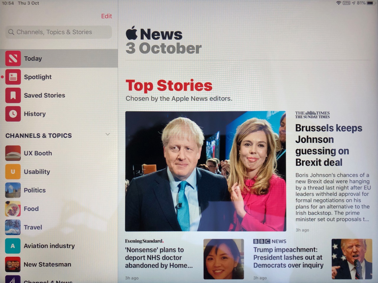
Even in these circumstances dark mode significantly increases the number of obviously visible reflections on the screen. This makes it harder for me to work and focus, as my reading is significantly slowed down by reflections and finger smudges obscuring the text on the screen. I found this to be the case even in low light situations, such as reading on the sofa in the evening where room lighting creates noticeable reflections. This just isn’t an issue with light themes as reflections are considerably less noticeable.
I’d originally planned to weave this into a conclusion about how dark mode isn’t a great feature from a user experience perspective because it smells like a direct implementation of what users have been asking for as opposed to a thoughtful translation of their needs. I was going to argue that there are better ways of helping people focus and read, and that it would make sense to explore these instead.
Then I realised I was completely wrong.
The fact that dark mode is being released in 2019, when most operating systems are essentially feature complete, demonstrates the exact opposite. There must have been so many times during the lifetime of Mac OS, Windows and iOS where dark mode has been bumped further down the backlog.
Instead, these teams have focused on building genuinely useful features which help people focus and read. Because of this we can benefit from features such as ‘do not disturb’, seamless screen scaling, night shift mode and reader mode in browsers to name just a few.
My takeaway is that we’ve just reached the point where there are very few valuable new features left in the backlog. This is why 2019 is the year of dark mode.
Anyway, for now I’m switching back to good-old “light mode”.
Yearning to read more about the dark side of dark mode?
After writing the draft of this post, I discovered that many of the other supposed benefits of dark mode aren’t real either… I recommend reading Adam Engst’s post “The Dark Side of Dark Mode” which goes into a lot more depth about why dark mode is worse than regular old light mode in most situations.
Leave a reply